Nestlé Professional is a consulting business unit in Nestlé dedicated to provide creative branded food and beverage solutions to their operation partners like food chains, restaurants and café.
In 2012 Nestlé Professional group engage Inkmason International to design their first customer engagement center in China, which will be rolled out in at least 5 different cities in China. They have chosen Beijing as their first center for its close proximity to their Greater China headquarter, one city block away in WangJing area. It gives them a great flexibility in managing the facility as well as using the it as their training center. Since our designers designed the corporate’s headquarter in 2009, it becomes natural for Nestlé professional to engage Inkmason International in this new project and expect us to create a space that is consistent to their headquarter.
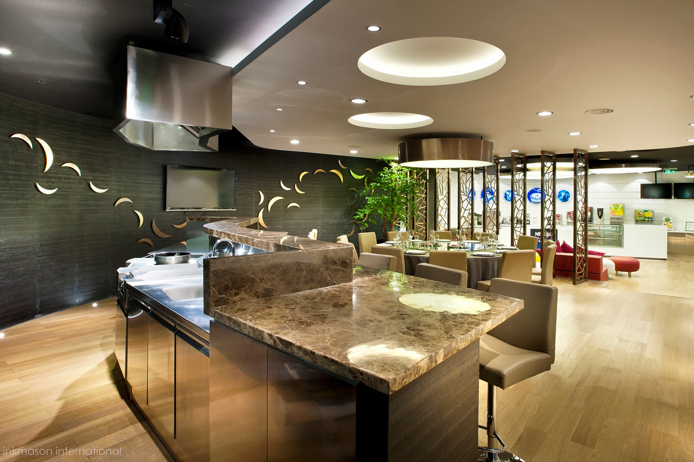
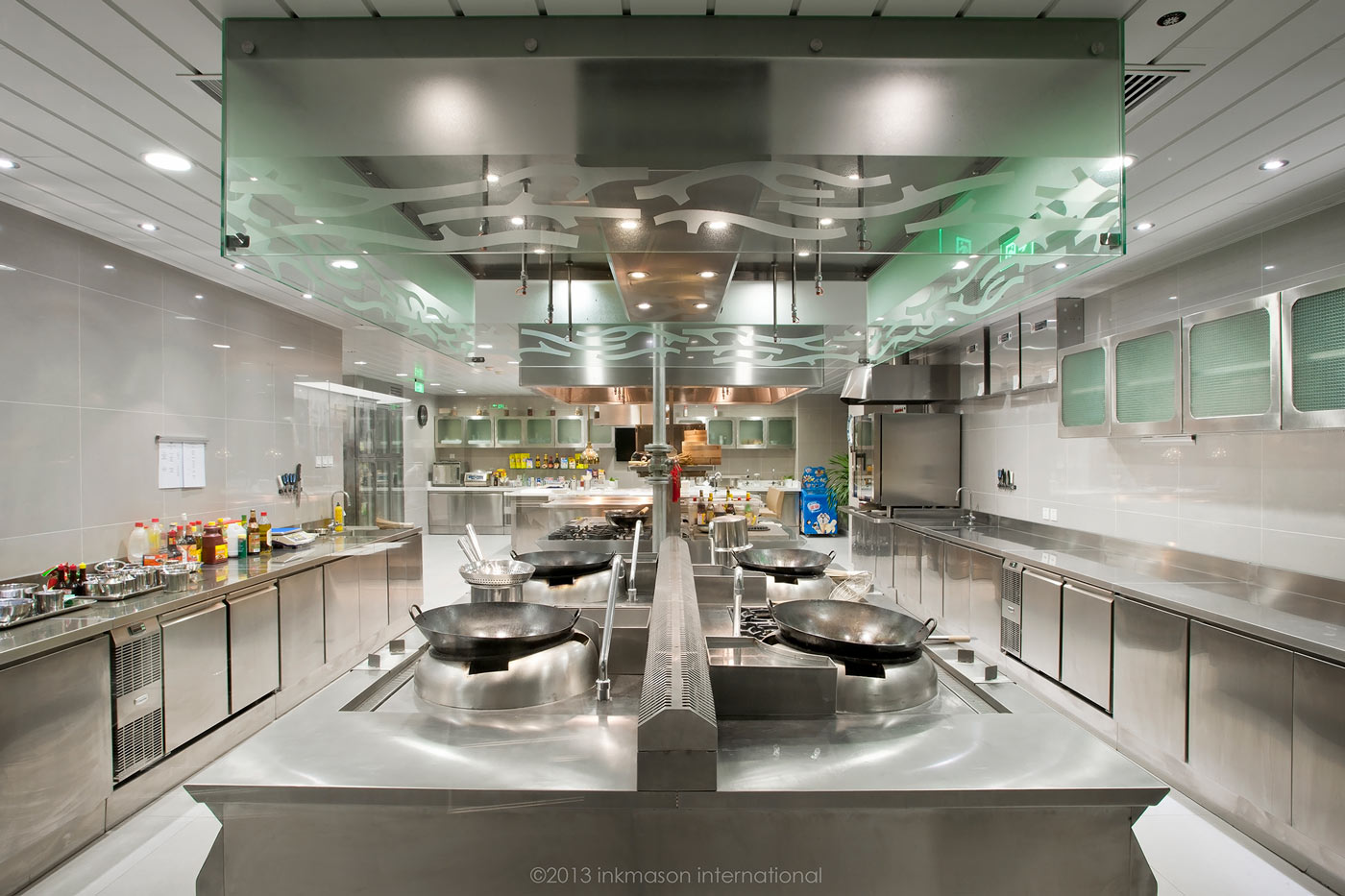
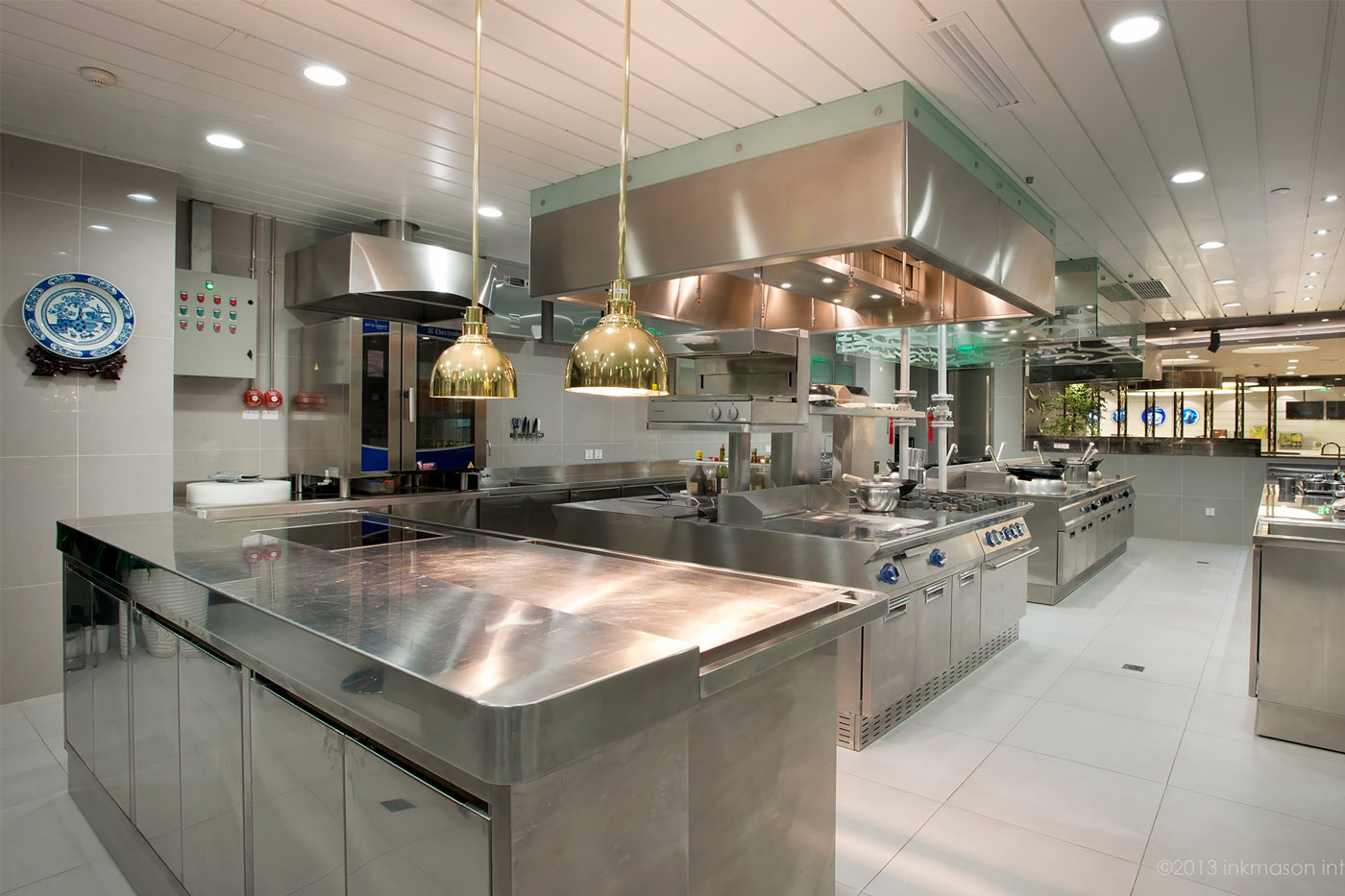
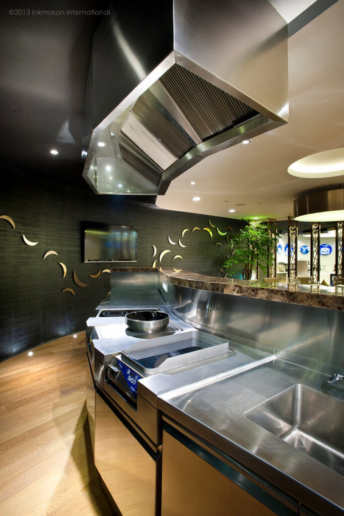
The total area of the new center is XXXsqm, which is not big considering the fact that it consisted of a full function western and Chinese kitchen, an open show kitchen counter, a Chinese banquet table setting, a coffee and beverage training bar counter, a café seating area, a training center for 45 people, a tasting room, storage area, male and female guest washrooms and an operation office. With it’s variety of functions, our designers created a layout plan that allows fluid circulation with corner-less pockets of function, yet maximizing the efficiency of the floor plate.
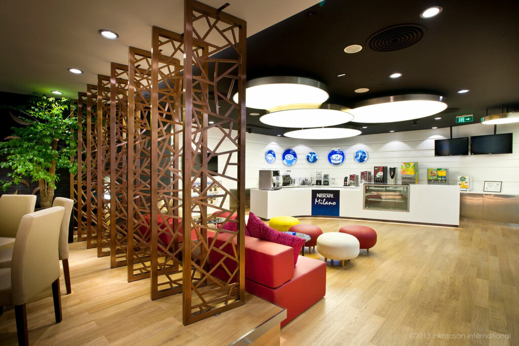
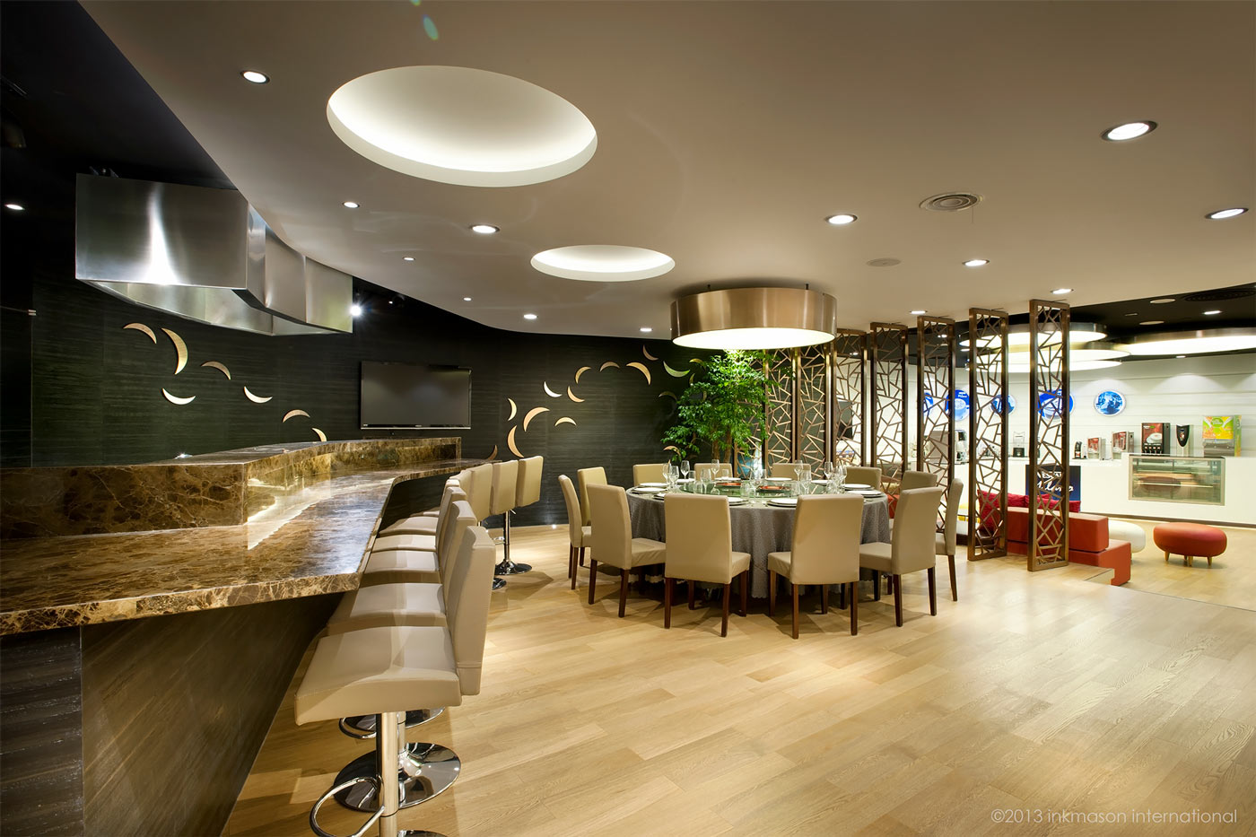
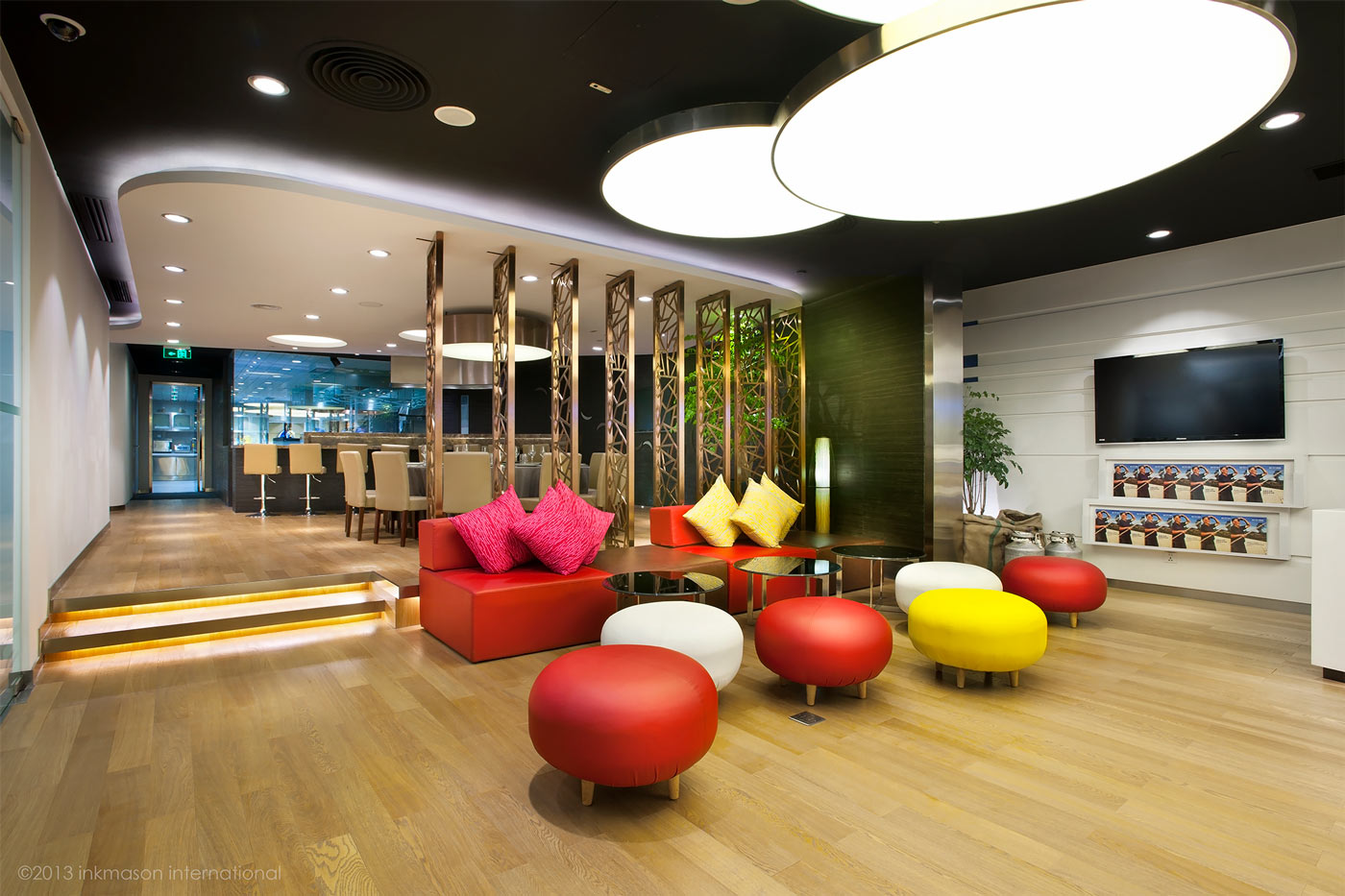
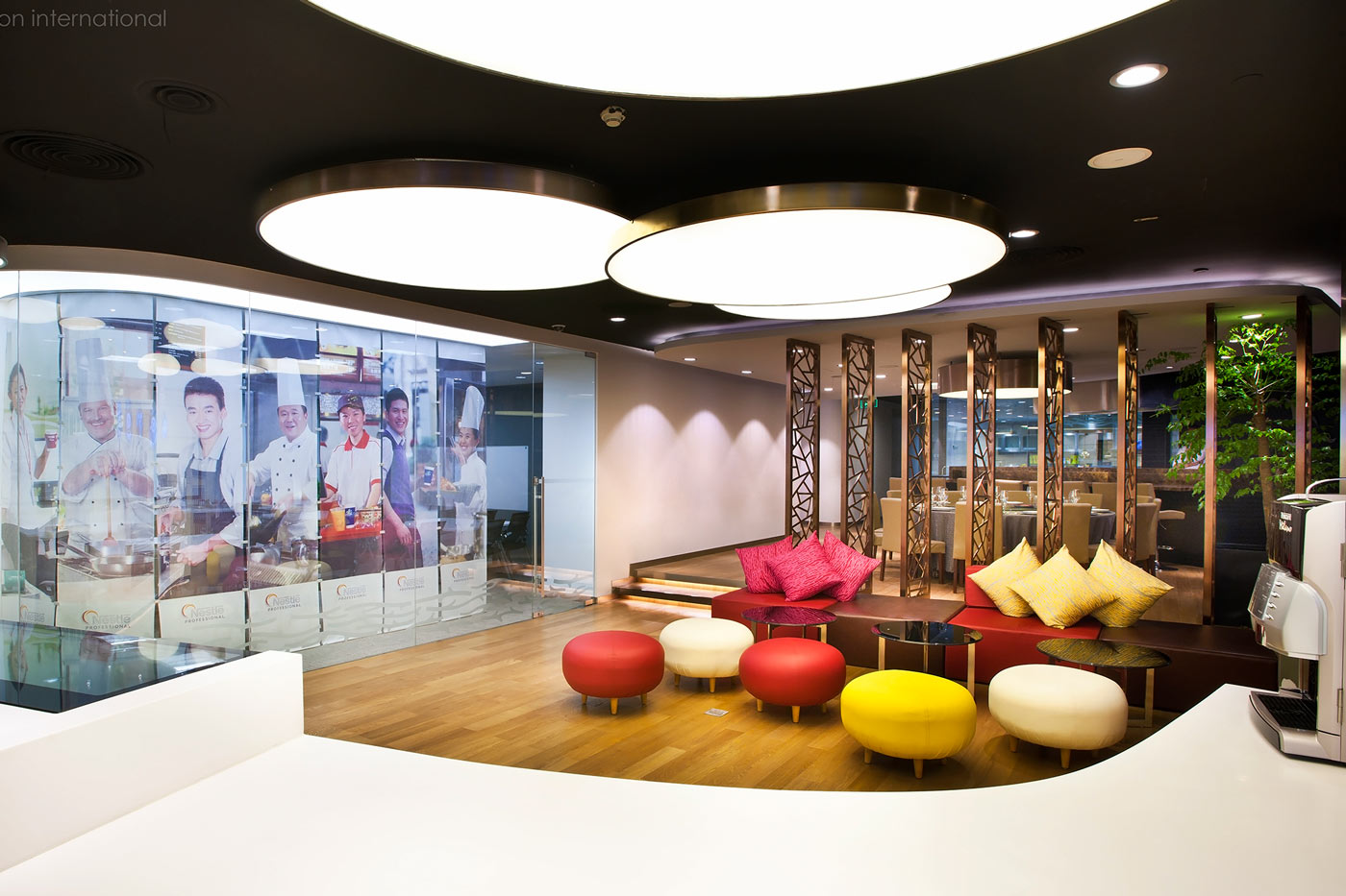
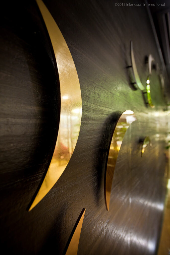
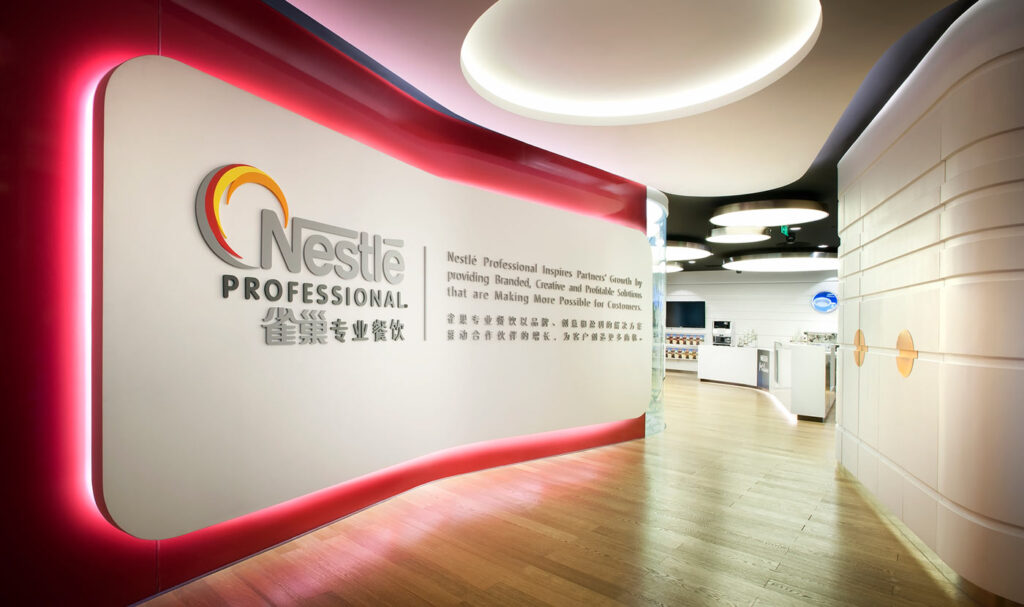
At the entrance, a large logo wall gives the whole center a prominent identity, at the same time acting as the dividing wall for the training center behind. Following the logo wall that extends into the central area of the facility, the coffee and beverage training bar counter wraps around the corner with a branding backdrop that highlights different beverage product brands in Nestlé. A café seating is next to the counter, against a moveable metal screen with modern chinese motif that separate the informal coffee area and the formal Chinese banquet table. To give the formal Chinese banquet area a more distinctive corporate feeling and a higher end dining experience, our designer used the NP logo to create an abstract act work on the wall with brass plates on a rough black marble wall. The result resembles gold fishes swimming in a Chinese ink wash painting. The space is designed so it flows from one into another, yet allowing distinctive atmosphere.
